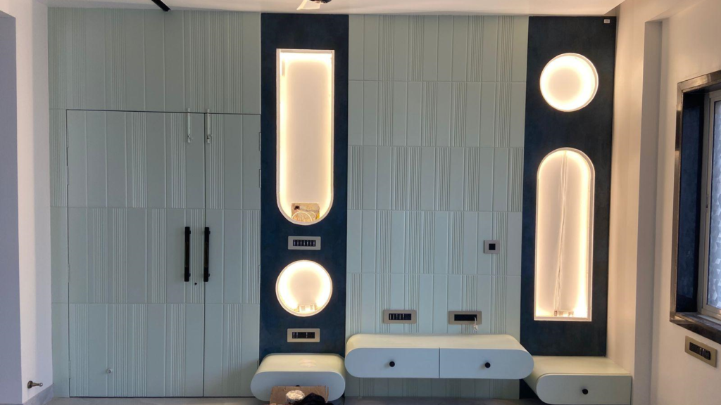
The colors you choose for your home or office can have a significant impact on mood, productivity, and overall aesthetics. While a home’s color palette should reflect comfort and personal style, an office should promote efficiency and brand identity. In this blog, we’ll guide you through selecting the perfect color scheme for both residential and commercial spaces.
1. Understanding Color Psychology
Colors influence emotions and behaviors, making it essential to choose shades that align with the purpose of the space.
Warm Colors (Red, Orange, Yellow)
- Energizing, stimulating, and vibrant.
- Ideal for creative workspaces, dining areas, and social spaces.
Cool Colors (Blue, Green, Purple)
- Calming, relaxing, and refreshing.
- Suitable for bedrooms, offices, and study areas.
Neutral Colors (White, Beige, Gray, Brown)
- Timeless, versatile, and sophisticated.
- Great for both homes and offices as a base or accent color.
2. Choosing Colors for Your Home
Your home should reflect your personality while maintaining harmony and comfort. Consider these guidelines:
Living Room
- Opt for warm and inviting shades like soft beige, muted greens, or light blues.
- Earthy tones create a cozy atmosphere, while accent walls in bold colors add depth.
Bedroom
- Stick to calming colors such as pastels, blues, or lavender to promote relaxation.
- Avoid overly bright or stimulating colors like red, which can disrupt sleep.
Kitchen & Dining Area
- Warm tones like soft yellow or terracotta enhance appetite and warmth.
- White or light neutrals create a clean and spacious feel.
Bathroom
- Light blues, whites, or soft greens give a spa-like, refreshing ambiance.
- Avoid very dark colors, as they can make the space feel smaller.
3. Choosing Colors for Your Office
A well-planned office color scheme enhances productivity, focus, and branding. Here’s how to choose wisely:
Reception Area
- Choose welcoming and brand-aligned colors like warm neutrals or soft blues.
- A touch of accent color can make the space more dynamic.
Workspaces
- Blue and green promote focus and creativity, making them great for office settings.
- Light grays or beiges keep the space neutral yet professional.
Meeting Rooms
- Consider a mix of calming neutrals with a pop of energy (like deep green or burnt orange) to encourage collaboration.
- Avoid overly bright or dark colors, as they can be distracting.
Break Room
- Use uplifting shades like soft yellow or light green to create a relaxing and cheerful atmosphere.
- Avoid colors that are too intense, which may prevent relaxation.
4. Tips for Creating the Perfect Color Palette
✅ Use the 60-30-10 Rule:
- 60% dominant color (walls)
- 30% secondary color (furniture, curtains)
- 10% accent color (art, décor, accessories)
✅ Consider Natural Light:
- Rooms with plenty of sunlight can handle darker shades.
- Dark rooms should have lighter tones to prevent a cramped feel.
✅ Test Before Finalizing:
- Paint small patches and observe how they look in different lighting conditions.
✅ Harmonize with Existing Elements:
- Consider flooring, furniture, and lighting before finalizing colors.
Conclusion
Choosing the perfect color palette for your home or office requires a balance of aesthetics, functionality, and psychology. While homes should feel comfortable and personalized, offices should be designed to boost productivity and professionalism. By following these tips, you can create a well-balanced and visually appealing space.


